How to Analyze Your Asset Allocation in Detail with the Allocation Breakdown Widget
Knowing you have a 60/40 portfolio is not the same as knowing what that actually means across your real holdings. The Allocation Breakdown widget shows the precise weight, value, and performance of every category in your portfolio — whether you group by asset type, sector, region, currency, or any other dimension.
This guide explains what the widget shows, how to use the grouping options to answer different questions, and how to combine it with other widgets for a complete allocation picture.
TL;DR
- ✓Why Is a Detailed Allocation Breakdown Necessary?
- ✓What Does the Allocation Breakdown Widget Display?
- ✓How Do You Configure the Allocation Breakdown Widget?
- ✓Which Grouping Should You Use?
- ✓How Do You Use the Breakdown for Rebalancing?
Why Is a Detailed Allocation Breakdown Necessary?
Target allocations drift over time. A portfolio that started as 60% equities and 40% bonds might become 70/30 after a strong equity rally without a single conscious decision. Without a detailed breakdown, you can miss this drift entirely — or know it has happened in aggregate without understanding which specific assets or categories are responsible.
The Allocation Breakdown widget makes the current state of your portfolio explicit and granular. Instead of a single percentage per asset class, it shows you the exact weight, absolute value, and period performance for every row — giving you everything you need to decide whether to rebalance.
You cannot manage what you cannot measure. Allocation breakdown turns a vague sense into precise data.
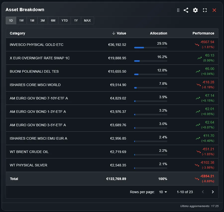
What Does the Allocation Breakdown Widget Display?
The widget shows a table where each row represents a category of your portfolio and each column shows a key metric: weight as a percentage of total, value in your base currency, and performance over the selected time period. A totals row at the bottom summarizes the full portfolio.
The weight column is the most important for rebalancing decisions: it shows you directly where your portfolio is overweight or underweight relative to your targets. The performance column shows which categories are contributing to or detracting from your overall return.
How Do You Configure the Allocation Breakdown Widget?
Three settings control the widget. The portfolio filter selects which portfolios to include — useful for analyzing a specific strategy in isolation. The time period sets the performance window for the return column. The group-by setting is the most impactful choice: it determines what each row represents.
The group-by options include asset type, asset class, currency, sector, region, country, portfolio, and individual holding. Each grouping answers a different question about your allocation. Asset type gives the broadest picture; individual holding gives the most granular.
Which Grouping Should You Use?
Different groupings answer different allocation questions. Here are the most useful combinations:
- Group by asset type: see your split between equities, bonds, ETFs, cash, and alternatives. Best starting point for a top-level allocation check.
- Group by asset class: see developed equities, emerging equities, government bonds, corporate bonds, real estate, and commodities as separate rows. Best for strategic allocation review.
- Group by sector: see technology, healthcare, financials, energy, and other sectors. Best for checking concentration risk within your equity allocation.
- Group by region: see North America, Europe, Asia-Pacific, and emerging markets. Best for geographic diversification review.
- Group by currency: see your exposure to EUR, USD, GBP, JPY, and other currencies. Best when used alongside the FX Rates widget.
How Do You Use the Breakdown for Rebalancing?
The most direct rebalancing workflow starts with the weight column. Compare each row's weight against your target allocation. Rows significantly above target are candidates for trimming; rows significantly below target are candidates for adding. The absolute value column tells you the monetary amount involved.
For a more automated approach, pair the Allocation Breakdown with the Rebalancing Alert widget, which generates explicit buy and sell signals when allocations drift outside their target ranges. The breakdown gives you the analytical view; the alert widget gives you the action items.
How Does the Breakdown Differ from the Pie Chart Widget?
Both widgets show portfolio composition, but they serve different purposes. The Pie Chart widget is a visual representation — ideal for a quick at-a-glance understanding of how the portfolio is structured and for sharing or presenting your allocation.
The Allocation Breakdown is an analytical tool — it gives you precise numbers, percentage weights, absolute values, and performance data in a sortable table format. Use the Pie Chart for visual communication and the Breakdown for analysis and decision-making.
Can You Track Multiple Brokers in the Same Breakdown?
Yes. DonkyCapital consolidates all transactions from connected brokers into a unified model. The Allocation Breakdown can show your complete allocation across all brokers as if they were one portfolio, giving you a true picture of your total exposure regardless of where each asset is held.
You can also use the portfolio filter to isolate a single broker and see its allocation separately. This is useful for investors who deliberately run different strategies at different brokers and want to verify that each strategy maintains its intended allocation.
Frequently Asked Questions
Does the widget include cash in the allocation weights?
Yes, by default. Cash is included as a row in the breakdown and counts toward total weight. You can toggle cash off if you want to see the allocation of invested assets only.
Can I see the breakdown for a specific time period?
The time period filter controls the performance column — the returns shown for each category over the selected window. The weight and value columns always reflect the current state of your portfolio.
What is the difference between asset type and asset class?
Asset type is the instrument category: ETF, stock, bond, cash. Asset class is the economic exposure: equities, fixed income, real estate, commodities. An ETF can belong to any asset class depending on what it tracks.
How are custom categories handled?
DonkyCapital allows you to assign custom categories to assets that do not fit standard classifications. These appear as separate rows in the breakdown when you select the corresponding grouping.
Can I export the breakdown data?
Use the share button in the widget toolbar to export or share the current view.
Does the widget update automatically?
Yes. The breakdown recalculates every time you import new transactions or market prices are updated. Weight and value figures always reflect the latest available data.
See Exactly Where Your Money Is Allocated
Connect your broker accounts and DonkyCapital builds a complete allocation breakdown across all your holdings automatically — by asset class, sector, region, or currency.
Start for free