Dividend Heatmap & Dividends Over Time: Widgets to Visualise Your Passive Income
In brief
- ▸Dividend Heatmap: year-by-year visual calendar showing the months you received dividends
- ▸Dividends Over Time: bar chart of dividends by period (WEEKLY/MONTHLY/YEARLY) broken down by asset class
- ▸Both widgets are customisable and can be added to the dashboard in seconds
- ▸Ideal for investors building a passive income strategy who want to see growth over time
Monitoring dividends does not mean just knowing how much you received last month. It means understanding the temporal distribution of payments, the year-on-year growth, and which asset classes contribute most to your passive income. DonkyCapital introduces two new dedicated widgets for exactly this: the Dividend Heatmap and the Dividends Over Time widget.
These two visual tools integrate with the rest of the dashboard and transform raw dividend data into immediately readable information. In this guide we look at how they work, what they show, and how to use them to make more informed decisions about your income-oriented investment strategy.
In this guide
1. Why Should You Visualise Dividends Over Time?
Income-focused investors often face a common problem: dividends arrive at different times of year, from different assets, and in different currencies. A spreadsheet can collect the numbers, but it cannot give an immediate answer to the most important question: is my passive income growing year after year?
Another common challenge is the seasonality of dividends: many European equities pay once or twice a year (often in spring or autumn), while distributing ETFs pay quarterly or monthly. Without an aggregated view it is difficult to understand in which months cash flow is concentrated and where there are "gaps" to fill with more frequently distributing assets.
Building passive income is a slow process. DonkyCapital's dividend widgets make that growth visible, month by month, year by year.
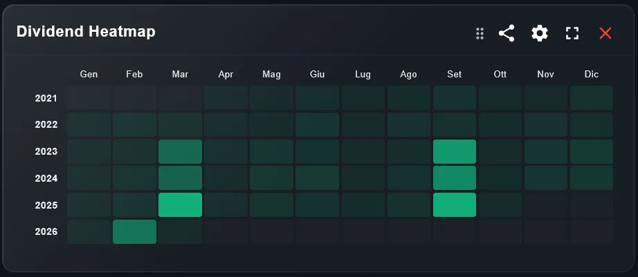
2. How Do You Read the Dividend Heatmap Widget?
The Dividend Heatmap is a grid calendar that shows, for each year/month combination, whether you received dividends — and how much. Lighter cells indicate low or no payments; more intense cells indicate months where you received more.
In the example, we see the "Scalable (2035)" portfolio: looking at the grid, it is immediately clear that March and September are the months with the most consistent payments, year after year. From 2023 onwards, a gradual intensification of colour is also visible, indicating that monthly passive income is growing over time.
This widget answers a precise question: in which months do I receive no dividends? If you see entire rows of empty cells for certain months, you might consider adding monthly or quarterly distributing ETFs to cover those periods.
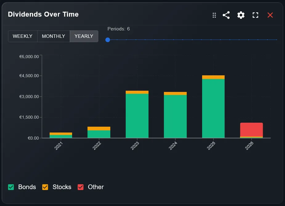
3. How Do You Read the Dividends Over Time Widget?
The Dividends Over Time widget shows dividends received as a bar chart, with three selectable aggregation modes: WEEKLY, MONTHLY, and YEARLY. Each bar is divided by asset class (Bonds, Stocks, Other), so you can see not only the total but also where the income comes from.
In the example shown, the annual view reveals consistent growth from 2021 to 2025: from around €200 to over €4,500 in annual dividends. 2026 is still in progress, so that bar appears partial. The colour breakdown (green for Bonds, orange for Stocks, red for Other) immediately shows how the composition of income changes over time: in the case shown, Bonds contribute the largest share.
The "Periods" slider at the top lets you filter how many periods to show in the chart, useful when you want to zoom in on recent years without losing sight of the historical trend.
4. How Do You Add the Widgets to the Dashboard?
- 1Open your dashboard in DonkyCapital and click "Add widget"
- 2Search for "Dividend Heatmap" or "Dividends Over Time" in the list of available widgets
- 3Select the portfolio to analyse and confirm
- 4Drag the widgets to your preferred position on the dashboard; you can resize and place them side by side for an immediate comparison
Both widgets update automatically every time new transactions are added or new data is imported from the broker. No manual refresh is needed.
You can add the same widgets to different portfolios to compare, for example, a growth portfolio and an income portfolio side by side.
5. How Do You Use the Two Widgets Together?
The most powerful combination is placing both widgets side by side on the same dashboard. The Dividend Heatmap gives you the fine-grained monthly view (each cell is a specific month of a specific year), while Dividends Over Time gives you the aggregated perspective for comparing across years or quarters.
A practical example: you are considering adding a high-dividend ETF to boost income in the summer months (July–August). The Heatmap shows you that those months are almost always empty in your current portfolio. Dividends Over Time, set to MONTHLY, confirms that the July–August flow is historically the lowest of the year. You have the numerical and visual confirmation that the purchase would be strategically worthwhile.
6. How Do You Build a Monthly Dividend Distribution Strategy?
The goal of many income investors is to achieve a dividend flow as evenly distributed as possible across all 12 months, avoiding long periods without income. This approach, often called a dividend calendar strategy, requires selecting assets with complementary distribution frequencies.
With the Dividend Heatmap you can immediately analyse your current portfolio and identify "uncovered" months. By combining it with the asset class information available in the Dividends Over Time widget, you can plan targeted purchases — for example, quarterly distributing bond ETFs that cover the weaker quarters — and monitor in subsequent years whether the strategy is improving the regularity of cash flow.
Frequently asked questions
Does the Dividend Heatmap also show reinvested dividends (DRIP)?
Yes. DonkyCapital identifies both received and automatically reinvested dividends. Both appear in the Heatmap as payments received in the corresponding month.
Can I filter the Dividend Heatmap for a single asset or ETF?
Currently the Heatmap shows aggregated dividends at portfolio level. To analyse a single asset you can use the dividend section in the security detail view directly within the portfolio.
Does the Dividends Over Time widget include distributions in foreign currencies?
Yes. All dividends are converted to the portfolio's reference currency using the exchange rate at the date of payment, so the chart always shows comparable values.
Can I use these widgets on multiple portfolios at the same time?
You can add the widget to each portfolio separately. If you want a consolidated view of all dividends across all portfolios, select the consolidated portfolio as the widget's data source.
Does the Dividend Heatmap start from the beginning of the portfolio's history?
Yes. The grid shows all years for which you have data in the portfolio, starting from the first recorded dividend. The more historical data you have, the more informative the heatmap becomes about passive income growth.
How are asset classes categorised in the Dividends Over Time widget?
The categories (Bonds, Stocks, Other) are based on the asset class classification assigned to each security in the portfolio. You can change the classification of an asset in the portfolio settings if needed.
Want to see your dividends grow over time?
Sign up for free and start monitoring your passive income with the Dividend Heatmap, the Dividends Over Time chart, and all the other dashboard widgets.
Start for free