How to Compare Your Portfolio Against Any Benchmark with the Line Chart Widget
Most investors check their portfolio balance but never ask the most important question: compared to what? If your portfolio grew 8% last year but the S&P 500 rose 24%, you underperformed significantly. The Line Chart widget on DonkyCapital makes this comparison instant, visual, and always up to date.
This guide explains how the widget works, how to configure it, and how to use it to make smarter investment decisions.
TL;DR
- ✓Why Does Comparing Against a Benchmark Matter?
- ✓What Does the Line Chart Widget Show?
- ✓How Do You Add a Benchmark to the Chart?
- ✓How Do You Configure the Line Chart Widget?
- ✓Which Benchmark Should You Choose?
Why Does Comparing Against a Benchmark Matter?
Without a reference point, portfolio returns are meaningless. A 10% gain sounds great — but not if cash in a savings account returned 4% and your benchmark returned 15%. Benchmark comparison is how professional fund managers are evaluated, and it should be how you evaluate your own portfolio too.
The problem is that most tracking tools — including spreadsheets — make benchmark comparison painful: you have to manually download index data, align dates, and build your own chart. The Line Chart widget does all of this automatically.
A return without a benchmark is just a number. A return versus a benchmark is a decision.
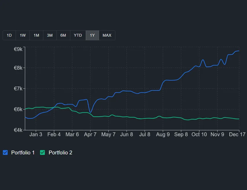
What Does the Line Chart Widget Show?
The widget displays the value of your portfolio over time as a smooth line chart. You can choose any time period from a single day to the full history of your portfolio. The chart updates automatically as new transactions and market prices come in.
What makes it powerful is the groupBy option: you can split the single line into multiple lines — one per portfolio, one per asset type, one per sector, one per currency, or even one per individual holding. This lets you see exactly which part of your portfolio is driving (or dragging) performance.
How Do You Add a Benchmark to the Chart?
In the widget settings, there is a benchmark field. You can select from a list of major indices including equity indices, inflation benchmarks, and bond indices. Once selected, the benchmark line appears on the same chart with the same time axis — no manual alignment needed.
You can also leave the benchmark empty to use the chart as a pure portfolio trend view without comparison. The widget works well either way.
How Do You Configure the Line Chart Widget?
Tap the settings icon on the widget to open the configuration panel. The main options are:
- Portfolio filter — select one, several, or all portfolios. If you select multiple, the chart shows the combined value.
- Time period — choose from 1 day, 1 week, 1 month, 3 months, 6 months, 1 year, year-to-date, or all time.
- Group by — select how to split the lines: by portfolio, asset type, asset class, currency, sector, region, country, or individual holding.
- Benchmark — pick an index to overlay on the chart, or leave blank for no benchmark.
- Include cash — toggle whether uninvested cash is included in the portfolio value.
Which Benchmark Should You Choose?
The right benchmark depends on your portfolio composition. If you hold mainly global equity ETFs, a world equity index is the most relevant comparison. If you hold European equities, a European index makes more sense. If you want to beat inflation, an inflation benchmark is appropriate.
A common mistake is comparing a diversified 60/40 portfolio against a 100% equity index. The equity index will almost always win during bull markets — but that comparison ignores the risk you have chosen not to take. Choose a benchmark that reflects your actual investment strategy.
What Are the Most Useful Group-By Combinations?
The groupBy option unlocks the most interesting use cases of this widget. Here are three configurations worth saving as separate widgets on your dashboard:
- 1Group by portfolio + no benchmark: see how each of your separate portfolios has evolved over time. Useful if you have one portfolio per broker or one per goal.
- 2Group by asset class + benchmark: compare your equity sleeve, bond sleeve, and cash against a blended benchmark. Immediately reveals which component is underperforming.
- 3Group by currency + no benchmark: understand how currency exposure is affecting your total return. If your EUR-denominated portfolio holds USD assets, currency moves appear clearly.
How Is the Line Chart Different from the Stack Chart and Portfolio Trends?
DonkyCapital has three widgets that show portfolio evolution over time, each with a different focus. Portfolio Trends uses a stacked area chart to show absolute value growth. Stack Chart uses a 100% stacked bar chart to show how your composition has shifted over time as percentages.
The Line Chart is the only one designed for direct performance comparison — between segments of your portfolio, and against external benchmarks. If you want to answer 'am I beating my benchmark?', this is the widget to use.
Frequently Asked Questions
Can I compare multiple portfolios against the same benchmark?
Yes. Select multiple portfolios in the filter and enable a benchmark. The chart will show the combined portfolio value as one line and the benchmark as a second line.
How far back does the benchmark data go?
Benchmark data coverage depends on the index. Most major equity and bond indices have data going back many years. The chart automatically aligns the benchmark to match your portfolio's available history.
Can I add more than one benchmark at the same time?
Currently the widget supports one benchmark line at a time. To compare against multiple benchmarks, you can add multiple instances of the widget to your dashboard, each configured with a different benchmark.
Does the chart account for dividends and capital gains reinvested?
The portfolio line reflects the total value of your holdings including unrealized gains and losses. If you reinvest dividends, those transactions appear in your portfolio and are included automatically.
What happens if I select 'group by holding' with many assets?
The chart will draw one line per holding, which can become hard to read if you hold many assets. This grouping works best with a small number of holdings or when filtering to a single portfolio.
Is the chart adjusted for currency differences?
All values are converted to your account's base currency using historical exchange rates, so the chart is always comparable across currencies.
Can I export the chart data?
You can share or download the chart directly from the widget toolbar. The export button is available in the top-right corner of the widget.
Start Comparing Your Portfolio Today
DonkyCapital connects to your broker accounts and builds your benchmark comparison chart automatically. No spreadsheets, no manual data entry.
Start for free