How to Compare Portfolio Performance Across Multiple Time Periods with the Performance Table Widget
A single return figure tells you almost nothing. Is 8% good? Compared to last month, last quarter, or last year, the answer changes completely. The Performance Table widget shows your portfolio returns across six time horizons simultaneously — so you can see not just where you are, but whether you are accelerating or slowing down.
This guide explains what the widget displays, how to configure it, and how to read the trend icons that make multi-period analysis fast.
TL;DR
- ✓Why Do You Need Multi-Period Performance in One View?
- ✓What Does the Performance Table Widget Display?
- ✓How Do You Configure the Performance Table Widget?
- ✓How Do You Read the Trend Icons?
- ✓What Are the Most Useful Grouping Combinations?
Why Do You Need Multi-Period Performance in One View?
Most investors check their portfolio performance occasionally and compare it to a vague memory of where things stood last time. Without a structured multi-period view, patterns stay invisible: a portfolio can look healthy at one year but be quietly deteriorating over the last month and quarter.
The Performance Table solves this by presenting six time periods side by side — daily, weekly, monthly, quarterly, six-month, and annual returns — in a single compact table. You can scan across a row and immediately see whether recent performance is stronger or weaker than the longer trend.
Returns are not static. The direction they are moving matters as much as the number itself.
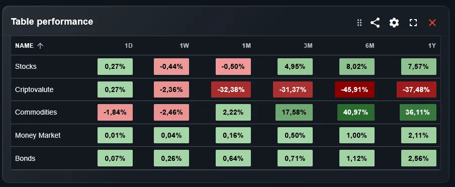
What Does the Performance Table Widget Display?
The widget shows a table where each row represents a grouping of your portfolio — a sub-portfolio, an asset type, an asset class, or a sector — and each column represents a time period: 1 day, 1 week, 1 month, 3 months, 6 months, and 1 year. Each cell shows the percentage return for that combination.
Next to each return value, a small trend icon indicates whether performance has improved or declined compared to the previous equivalent period. This means you can spot momentum at a glance: a row full of upward arrows signals sustained positive momentum; a mix of up and down arrows signals volatility.
How Do You Configure the Performance Table Widget?
Two settings control what the table shows. The portfolio filter selects which portfolios to include — you can combine all portfolios for an aggregate view or isolate one for focused analysis. The group-by setting determines what each row represents: by portfolio, by asset type, by asset class, or by sector.
The most useful grouping depends on what question you are trying to answer. Group by portfolio to compare your strategies against each other. Group by asset type to see whether equities, bonds, or cash are driving performance at each time horizon. Group by sector to identify which industry exposure is working and which is not.
How Do You Read the Trend Icons?
Each cell in the table has a small icon next to the return figure. An upward icon means performance for that period is better than the equivalent period ending one period earlier. A downward icon means it has worsened. A neutral icon means there is no significant change.
Read the icons across a row to understand momentum. If the 1-month return is negative but the trend icon is upward, it means this month was less bad than last month — a signal of potential recovery. If the 1-year return is positive but the trend icon is downward, the pace of gains is slowing — worth watching.
What Are the Most Useful Grouping Combinations?
Three groupings stand out for regular use. Grouping by portfolio gives a head-to-head comparison of your strategies across all time horizons — useful for deciding whether to rebalance between portfolios. Grouping by asset type shows whether the equity, bond, or alternative portion is leading or lagging at each period.
Grouping by asset class gives the most granular picture for a diversified ETF investor: you can see how developed market equities compare to emerging markets, bonds, and real estate across all six periods simultaneously. This is the most information-dense view the widget offers.
How Does the Performance Table Complement Other Widgets?
The Performance Table works best as a diagnostic layer. When the Portfolio Trends chart shows that growth has slowed recently, the Performance Table reveals which grouping is responsible and at which time horizon the slowdown began. When the Top Performers widget highlights a strong individual asset, the Performance Table shows whether the strength is recent or part of a longer trend.
A useful dashboard combination is to place the Performance Table alongside the Line Chart widget. The Line Chart shows the visual trajectory versus a benchmark; the Performance Table gives the precise numbers across time periods without requiring you to hover over chart points.
Can You Track Multiple Brokers in the Performance Table?
Yes. DonkyCapital consolidates transactions from all connected brokers into a unified portfolio model. The Performance Table can then show performance across all brokers combined, or you can use the portfolio filter to compare individual broker accounts against each other across all six time periods.
This is particularly useful if you hold different strategies at different brokers. The table immediately shows whether one strategy has been consistently stronger across all periods or whether the advantage is limited to a specific time horizon.
Frequently Asked Questions
What time periods does the widget cover?
The widget shows performance for six fixed periods: 1 day, 1 week, 1 month, 3 months, 6 months, and 1 year. These periods are calculated from today's date backwards and update automatically each day.
Are the returns shown absolute or percentage?
The Performance Table shows percentage returns. For absolute monetary gains and losses, use the P&L widget which is designed specifically for that view.
How is performance calculated when I have made multiple deposits?
Returns are calculated using the time-weighted return method, which neutralizes the effect of cash flows so that deposits and withdrawals do not distort the performance figure.
Can I sort the table by a specific column?
The table rows are determined by the group-by setting rather than by sorting. To find your best performer over a specific period, use the Top Performers widget which is designed for ranked sorting.
What does a blank cell mean?
A blank cell means there is not enough data for that combination — for example, if a portfolio was opened less than one year ago, the 1-year column will be empty until sufficient history exists.
Does the widget account for dividends?
Yes. Returns are calculated as total return, including both price appreciation and dividends received during the period.
Can I add this widget multiple times with different groupings?
Yes. You can place multiple instances of the Performance Table on your dashboard, each configured with a different group-by setting, to see portfolio, asset type, and sector views simultaneously.
See Your Full Performance Picture in Seconds
Connect your broker accounts and DonkyCapital calculates your multi-period performance table automatically — across all portfolios and asset classes.
Start for free