How to Read Your Portfolio Allocation with the Pie Chart Widget
Before you can manage risk, you need to see it. The Pie Chart widget gives you an instant visual breakdown of how your portfolio is distributed across asset classes, sectors, geographies, or individual positions — all in a single circle.
This guide explains what the pie chart shows, how slices are calculated, and how to use it to spot concentration risk and validate your intended allocation.
TL;DR
- ✓What Does the Pie Chart Widget Show?
- ✓How Are the Slices Calculated?
- ✓What Is Concentration Risk and How Does the Pie Chart Show It?
- ✓How Do You Use the Pie Chart Widget?
- ✓How Is the Pie Chart Different from the Allocation Breakdown Widget?
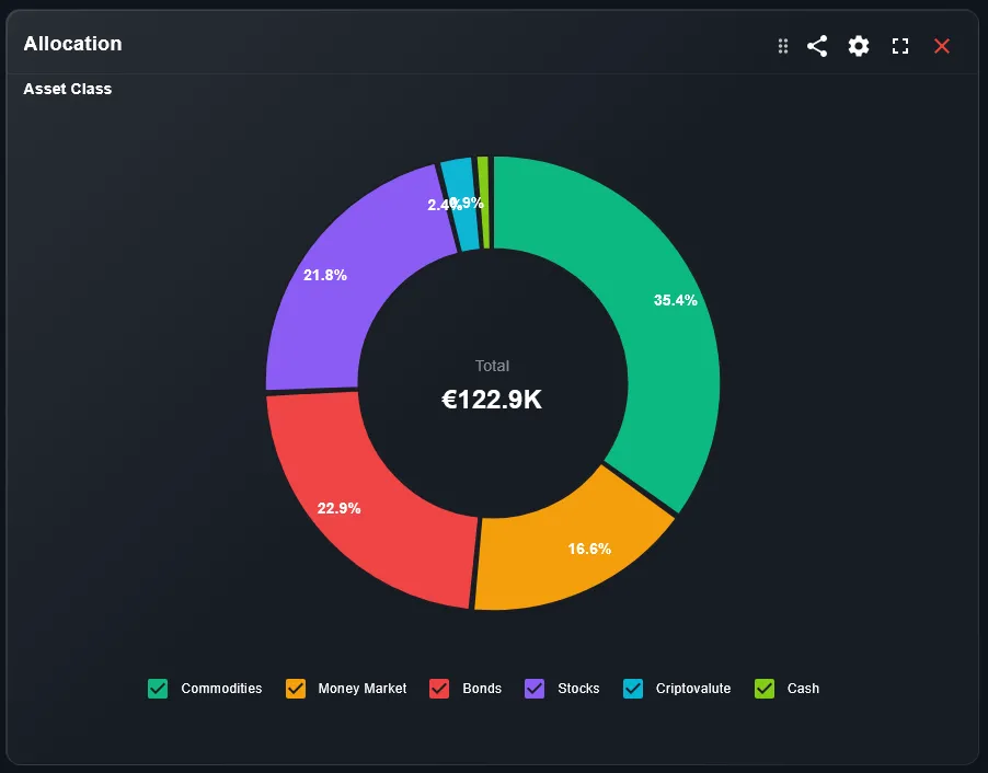
What Does the Pie Chart Widget Show?
The pie chart divides your entire portfolio into colored slices. Each slice represents one segment — a single stock, ETF, asset class, or any custom grouping you define in DonkyCapital. The size of each slice is proportional to its current market value as a percentage of the total portfolio.
The widget is interactive: you can click or tap a slice to see the exact name, value in your base currency, and percentage weight. Small slices are often grouped into an "Other" category to keep the chart readable.
You cannot manage what you cannot see. The pie chart makes allocation visible in one second.
How Are the Slices Calculated?
Each slice is calculated as: (current market value of position) / (total portfolio market value) × 100. DonkyCapital uses live or end-of-day prices depending on the asset type and your subscription level.
For multi-currency portfolios, all values are converted to your selected base currency before the percentages are computed. This ensures that a position held in USD is correctly weighted against one held in EUR.
What Is Concentration Risk and How Does the Pie Chart Show It?
Concentration risk is the danger of having too much of your portfolio in a single asset, sector, or geography. A well-diversified portfolio usually has no single slice exceeding 10-15% of the total. If one slice dominates — especially above 25-30% — your portfolio return is highly dependent on that one holding.
The pie chart makes concentration risk immediately visible: a dominant slice stands out visually, even if the numbers in a table might be easy to overlook.
How Do You Use the Pie Chart Widget?
Follow these steps to get the most from the widget:
- Open your DonkyCapital dashboard and locate the Pie Chart widget on your overview.
- Switch the grouping filter: view by individual position, by asset class, by sector, or by geography.
- Click or tap any slice to see the position name, current value, and percentage weight.
- Compare the visual to your target allocation. If any slice looks much larger than intended, flag it for review.
How Is the Pie Chart Different from the Allocation Breakdown Widget?
Both show current allocation, but in different formats. The Allocation Breakdown widget displays the data as a bar chart or list — better for reading exact numbers. The Pie Chart is better for a quick visual sanity check: does my portfolio actually look the way I intended?
For most investors, using both widgets together is ideal — the pie chart for fast visual diagnosis and the breakdown for precise numbers and rebalancing calculations.
How to Validate Your Allocation Against Your Target
Use the pie chart as a quick validation tool:
- 1Compare each major slice to your written investment policy or target allocation (e.g., 60% equities / 30% bonds / 10% cash).
- 2If a slice is significantly larger than your target, consider whether market drift or recent purchases caused the deviation.
- 3If the portfolio looks significantly different from your plan, use the Rebalancing feature in DonkyCapital to calculate what trades are needed.
Is the Pie Chart Available on Mobile?
Yes. The Pie Chart widget is fully optimized for mobile. Tap any slice to see its label and weight. On very small screens, the legend is shown below the chart rather than alongside it.
The pie chart is one of the most useful widgets on mobile because its visual format requires no scrolling or reading — you can check your allocation at a glance in under three seconds.
Frequently Asked Questions
Can I group slices by sector instead of individual position?
Yes. Use the grouping filter above the widget to switch between individual position, asset class, sector, and geography views.
Why are some positions grouped into "Other"?
Positions with a very small weight (typically below 1-2%) are grouped into "Other" to keep the chart readable. Hover or tap the "Other" slice to see a breakdown.
Does the pie chart update in real time?
Price data is refreshed at market open, during trading hours, and at market close depending on the asset type. The chart reflects the most recent available prices.
Can I set a target allocation and compare it to the pie chart?
Target allocation comparison is available in the Rebalancing section of DonkyCapital. The pie chart shows current state; the rebalancing tool shows the gap between current and target.
Why does my pie chart change even without new trades?
Market price movements change the value of each position relative to the others. Even without trading, your portfolio weights shift daily as prices move.
Is cash shown as a slice in the pie chart?
Yes, if cash is tracked as a position in DonkyCapital. Cash is a valid asset class and contributes to your overall allocation.
See Your Allocation Clearly in One View
Connect your brokers and get a real-time pie chart of your full portfolio allocation — for free.
Start for free