How to Spot Your Best and Worst Assets Instantly with the Portfolio Heatmap Widget
When you have many positions, spotting what is working and what is not can take minutes of scrolling. The Portfolio Heatmap widget compresses your entire portfolio into a single color-coded grid — green for gains, red for losses — so you can see performance patterns at a glance.
This guide explains how the heatmap is built, what the colors and sizes mean, and how to use it to make faster, better-informed portfolio decisions.
TL;DR
- ✓What Is the Portfolio Heatmap Widget?
- ✓How Are Colors and Sizes Calculated?
- ✓What Can You Learn from the Heatmap at a Glance?
- ✓How Do You Use the Portfolio Heatmap Widget?
- ✓Why Does the Heatmap Look Different from Yesterday?
What Is the Portfolio Heatmap Widget?
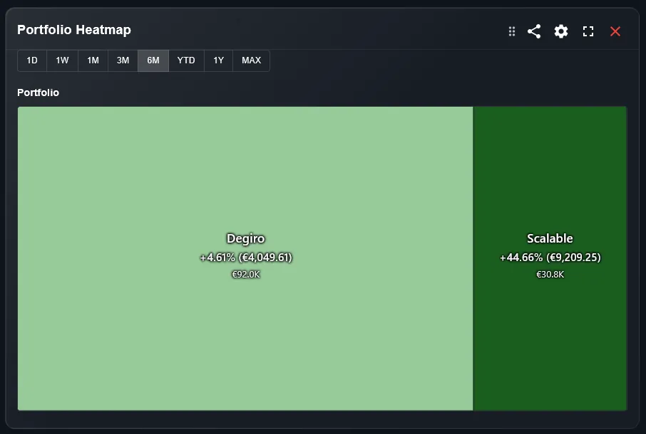
The heatmap is a treemap-style visualization where each asset in your portfolio is represented as a rectangle. The size of each rectangle corresponds to the weight of that asset in your portfolio. The color intensity shows performance — deep green for strong gains, deep red for significant losses.
This means your largest and best-performing positions are the most visually prominent. You see what matters most without reading a table.
A table tells you numbers. A heatmap tells you a story.
How Are Colors and Sizes Calculated?
Rectangle size is proportional to the current market value of each position relative to your total portfolio. A position worth 20% of your portfolio occupies 20% of the heatmap area.
Color is determined by the percentage return of each position over the selected period. You can typically switch between daily return, weekly return, monthly return, and return since purchase using the filter above the widget.
What Can You Learn from the Heatmap at a Glance?
A mostly green heatmap with large rectangles suggests your biggest positions are performing well — a healthy sign. A large red rectangle dominating the visual means your most significant holding is dragging performance.
Small red rectangles surrounded by green are easier to tolerate — they have limited portfolio impact. Large red rectangles demand attention and possibly a review of your thesis for that position.
How Do You Use the Portfolio Heatmap Widget?
Follow these steps to use the heatmap effectively:
- Open your DonkyCapital dashboard and locate the Portfolio Heatmap widget on your overview page.
- Select the performance period using the filter: today, this week, this month, or since purchase.
- Click on any rectangle to see the asset name, current value, and percentage return for the selected period.
- Look for large red rectangles — these represent your biggest underperformers by portfolio weight. These deserve a deeper review.
Why Does the Heatmap Look Different from Yesterday?
The heatmap updates with market prices in real time (or at close of day, depending on asset type). As prices change, both the color and the relative sizes of rectangles may shift — positions that gain in value grow larger.
Over time, a position that outperforms consistently will grow to occupy more of the heatmap. This is a natural and useful signal: your winner is becoming more dominant in your portfolio.
How to Act on What the Heatmap Shows
The heatmap is a diagnostic tool. Here is how to use what it shows:
- 1Large red rectangle: revisit your investment thesis. Is the underperformance temporary or structural?
- 2Dominant green rectangle: check whether this position now exceeds your target allocation. It may be time to rebalance.
- 3Many small rectangles of similar size: your portfolio may be too diversified to have meaningful impact from any single position.
Is the Heatmap Available on Mobile?
Yes. The heatmap widget is touch-optimized for mobile. Tap any rectangle to see the position details. On smaller screens, very small positions may be grouped or displayed as a compact list beneath the main heatmap.
For the most useful overview, use the desktop view if you hold more than 15 positions, as small rectangles can be difficult to tap accurately on a phone screen.
Frequently Asked Questions
Can I filter the heatmap by asset class?
Yes. DonkyCapital allows you to filter the heatmap to show only equities, ETFs, crypto, or other asset types depending on your portfolio composition.
What does a grey rectangle mean?
A grey or neutral rectangle typically means no price data is available for that period, or the asset had zero change. Check that the asset is correctly linked to a price source.
Can I switch between daily and total return views?
Yes. Use the period filter above the widget to switch between today, this week, this month, and return since purchase.
Why are some positions missing from the heatmap?
Positions with zero market value, manually entered assets without price feeds, or assets in unsupported markets may not appear. Check your holdings list for any warnings.
Does the heatmap include cash positions?
Cash and money market positions can appear on the heatmap if they are tracked in DonkyCapital. Their return is typically near zero, so they appear as neutral or very light-colored rectangles.
How is this different from a standard portfolio table?
A table requires you to scan row by row. The heatmap gives you the full picture in one second — which positions are large, which are performing, and where the risk is concentrated.
See Your Entire Portfolio in One View
Connect your brokers and get instant heatmap visibility across all your positions — for free.
Start for free