How to Track How Your Portfolio Composition Changes Over Time with the Stacked Chart Widget
Knowing your current allocation is useful — but knowing how it has shifted over months or years is far more powerful. The Stacked Chart widget shows you how the weight of each asset class, sector, or individual holding has evolved over time as a stacked area chart.
This guide explains how to read the stacked chart, what the layers represent, and how to use it to understand drift, concentration, and rebalancing needs.
TL;DR
- ✓What Is the Stacked Chart Widget?
- ✓What Can Each Layer Tell You?
- ✓How Is This Different from the Allocation Breakdown Widget?
- ✓How Do You Use the Stacked Chart Widget?
- ✓What Does Unintentional Drift Look Like on the Chart?
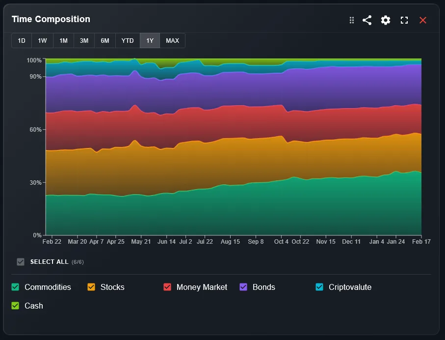
What Is the Stacked Chart Widget?
The Stacked Chart is an area chart where each colored layer represents one segment of your portfolio — typically an asset class, sector, or individual position. The layers are stacked on top of each other, so the total height of the chart always equals 100% of your portfolio value.
As you scroll through time, you can see how the relative weight of each layer grew or shrank. A layer that expands over time means that segment gained value faster than the rest of your portfolio.
Your allocation today is the result of decisions made months ago. The stacked chart shows that journey.
What Can Each Layer Tell You?
Each layer color corresponds to a segment defined in your DonkyCapital settings — you can group by asset class (equities, bonds, crypto, cash), by geography, by sector, or by individual position. The layer width at any point in time shows the percentage that segment represents.
A layer that grows steadily may indicate strong performance or regular top-up purchases. A layer that shrinks might reflect underperformance, partial sales, or relative dilution as other segments grew faster.
How Is This Different from the Allocation Breakdown Widget?
The Allocation Breakdown widget shows your current allocation as a static snapshot — useful for today. The Stacked Chart adds the time dimension: it shows how your allocation has evolved, not just where it stands now.
Use the Allocation Breakdown to act on today. Use the Stacked Chart to understand how you got here — and whether your drift is intentional or a side effect of market movements.
How Do You Use the Stacked Chart Widget?
Follow these steps to get the most from the widget:
- Open your DonkyCapital dashboard and navigate to the Stacked Chart widget.
- Select the grouping: by asset class, by sector, by geography, or by individual position using the filter above the chart.
- Choose the time range: 3M, 6M, 1Y, 3Y, or All Time.
- Hover over any point to see the exact percentage breakdown of your portfolio on that date.
What Does Unintentional Drift Look Like on the Chart?
Drift happens when market returns cause your allocation to deviate from your target without any action on your part. On the stacked chart, it appears as one layer steadily expanding while others shrink — even if you made no trades.
For example, if equities outperform bonds for two years, the equity layer will visually dominate the chart toward the right end. This is useful information: it may be time to rebalance back to your target allocation.
How to Use the Stacked Chart to Trigger a Rebalancing Review
Use the chart as a diagnostic trigger rather than a trading signal:
- 1If a single layer now exceeds your intended maximum weight (e.g., equities above 80%), flag it for review.
- 2If a layer that was once significant has nearly disappeared, check whether that was intentional (you sold) or passive drift.
- 3Compare the chart at 1Y versus 3Y to see whether portfolio drift is accelerating or stabilizing over time.
Is the Stacked Chart Available on Mobile?
Yes. The Stacked Chart widget is fully responsive on mobile. Tap any point on the chart to see the allocation breakdown for that date. On small screens, individual layer labels may be hidden to save space — a legend is shown below the chart instead.
For detailed analysis across multi-year time ranges, the desktop view is recommended, as the full chart width makes it easier to distinguish narrow layers.
Frequently Asked Questions
Can I choose how to group the layers?
Yes. DonkyCapital lets you group by asset class, sector, geography, currency, or individual position. The grouping can be changed using the filter above the widget.
Why does my stacked chart show sudden jumps?
Sudden changes usually coincide with large deposits, withdrawals, or new broker connections. These are real financial events, not data errors.
Does the chart show percentage or absolute value?
By default the stacked chart shows percentage of total portfolio. Some views may allow switching to absolute value — check the widget settings.
Can I export the chart data?
Data export is on the DonkyCapital roadmap. Currently you can screenshot the chart or use the hover tooltip to read specific values.
Why do some layers appear very thin?
Very thin layers represent segments with a small portfolio weight — typically below 2-3%. These are still tracked but may be hard to read visually. Consider hovering directly on them for precise values.
Is the stacked chart useful for ETF portfolios?
Absolutely. For ETF portfolios grouped by asset class or geography, the stacked chart clearly shows how your regional or sector exposure has shifted over time — very useful for passive investors.
Understand How Your Portfolio Has Evolved
Connect your brokers and see your full allocation history as a stacked chart — for free.
Start for free