How to Read Your Portfolio Performance Over Time with the Timeline Widget
Most investors know their current portfolio value — but few can answer: how did it get here? The Performance Timeline widget gives you a clear, scrollable history of your portfolio value from day one to today.
This guide explains what the widget shows, how to interpret the chart, and how to use it to spot trends and evaluate your investment strategy.
TL;DR
- ✓What Does the Performance Timeline Widget Show?
- ✓How Is the Timeline Different from the Line Chart Widget?
- ✓What Can You Learn from the Shape of the Curve?
- ✓How Do You Use the Performance Timeline Widget?
- ✓Why Does the Timeline Sometimes Show Jumps?
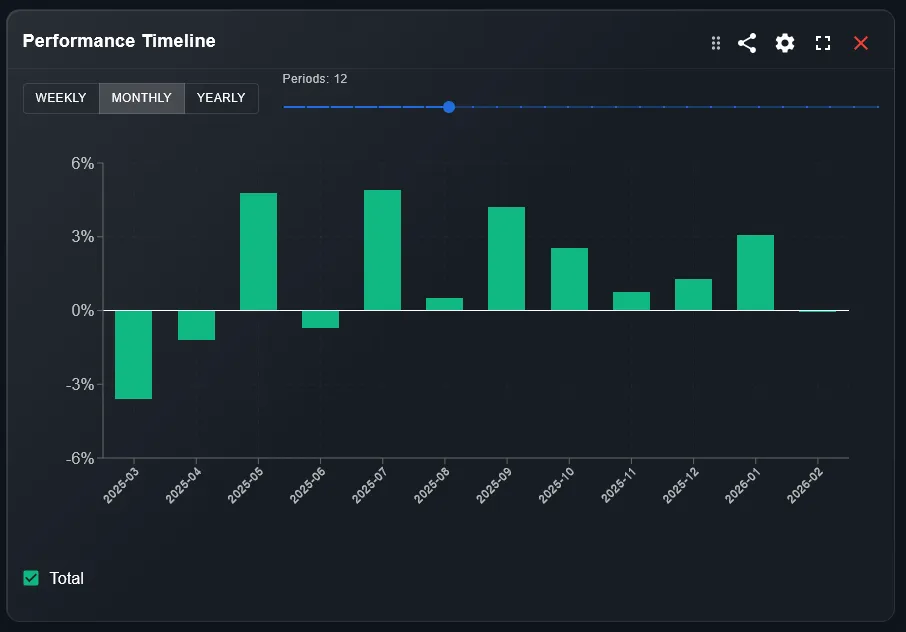
What Does the Performance Timeline Widget Show?
The Performance Timeline displays your total portfolio value plotted over time as a continuous line chart. Each point on the line represents the portfolio valuation on that day, factoring in all your holdings, their prices, and any currency conversions.
Unlike a snapshot, the timeline gives you the full story: deposits, withdrawals, market swings, and compounding — all in one view.
Your portfolio value today is just one frame. The timeline shows the whole film.
How Is the Timeline Different from the Line Chart Widget?
The Line Chart widget (benchmark comparison) shows your portfolio return as a percentage versus a market index. The Performance Timeline shows absolute portfolio value in your base currency — no comparison, just the raw history.
Use the Timeline to understand your wealth progression. Use the Line Chart to evaluate whether your strategy outperformed the market.
What Can You Learn from the Shape of the Curve?
A steadily rising curve with minor dips suggests a diversified, resilient portfolio. Sharp drops followed by recoveries show market exposure and your holding discipline. A flat or declining line may indicate poor asset selection or a bear market period.
The slope of the curve during specific periods — 2020 crash, 2022 rate hikes, 2024 rally — tells you how your portfolio reacted to real macro events.
How Do You Use the Performance Timeline Widget?
Follow these steps to get the most from the widget:
- Open your DonkyCapital dashboard and navigate to the Timeline widget on your overview page.
- Select the time range: 1M, 3M, 6M, 1Y, 3Y, or All Time using the filter buttons.
- Hover over any point on the chart to see the exact portfolio value on that date.
- Compare the shape of the curve across different periods to identify your best and worst performing phases.
Why Does the Timeline Sometimes Show Jumps?
Sudden vertical jumps in the timeline usually mean a large deposit or a new broker connection was added. A sharp drop may indicate a large withdrawal or a position that was closed at a loss.
These jumps are not errors — they are real events in your portfolio history. The widget reflects your actual financial activity, not just market movements.
How to Combine the Timeline with Other Widgets
The Timeline works best as a starting point. Once you spot an interesting period, use these widgets to dig deeper:
- 1Line Chart widget — compare your return against a benchmark during the same period.
- 2Profit & Loss widget — identify which assets drove gains or losses in that phase.
- 3Allocation Breakdown widget — check whether your asset mix changed significantly over time.
Is the Performance Timeline Available on Mobile?
Yes. The Performance Timeline widget is fully responsive and available on the DonkyCapital mobile view. The touch interface supports swipe gestures to scroll through time periods and tap to inspect specific dates.
For the clearest picture, use the desktop view when analyzing long time ranges (3Y or All Time), where the full width of the chart makes trend identification easier.
Frequently Asked Questions
Does the timeline include dividends?
Yes. Dividends are reinvested or shown as cash, depending on your settings. They are reflected in the portfolio value plotted on the timeline.
Why does my timeline start later than my first trade?
The timeline starts from the date your first position was logged in DonkyCapital. If you imported historical trades, the chart goes back to the earliest import date.
Can I export the timeline data?
DonkyCapital is working on data export features. Currently, you can take screenshots of the chart or note specific values by hovering.
Why is the timeline different from my broker app?
Your broker shows only assets held with them. DonkyCapital aggregates all brokers, so the timeline reflects your total wealth across all connected accounts.
Does currency fluctuation affect the timeline?
Yes. If you hold assets in foreign currencies, exchange rate movements will affect the portfolio value shown. All values are converted to your base currency.
Can I add annotations or notes to the timeline?
This feature is on the roadmap. For now, the hover tooltip shows the date and value, but custom annotations are not yet available.
Track Your Full Portfolio History
Connect all your brokers and see your complete performance timeline in one place — for free.
Start for free