How to Visualize Your Portfolio Growth Over Time with the Portfolio Trends Widget
Knowing your current portfolio value is useful. Seeing how it has evolved month by month, year by year — and understanding which part is driving the growth — is what separates passive monitoring from active understanding. The Portfolio Trends widget gives you that picture at a glance.
This guide explains what the widget shows, how its stacked area chart works, and which configuration gives you the most useful insight for your situation.
TL;DR
- ✓Why Does Visualizing Portfolio Growth Over Time Matter?
- ✓What Does the Portfolio Trends Widget Show?
- ✓How Do You Configure the Portfolio Trends Widget?
- ✓What Are the Most Useful Display Modes?
- ✓How Do You Use Portfolio Trends Alongside Other Widgets?
Why Does Visualizing Portfolio Growth Over Time Matter?
A single number — your current balance — tells you where you are, not how you got there. Growth over time reveals patterns that a snapshot cannot: whether your portfolio is accelerating, plateauing, or declining; whether contributions are doing most of the work or market returns are; whether a recent market drop erased months of gains.
Without a historical chart, these dynamics stay hidden. The Portfolio Trends widget surfaces them with a clean, readable visualization that updates automatically as you add new transactions.
Wealth is built over time, not at a point in time. The chart makes that process visible.
What Does the Portfolio Trends Widget Show?
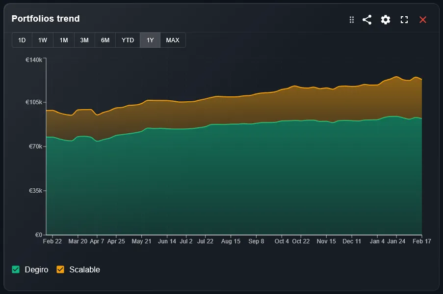
The widget displays your portfolio value as a stacked area chart. Each colored area represents one component of the portfolio — a sub-portfolio, an asset type, or another grouping of your choice — stacked on top of the others. The combined height of all areas at any point in time equals your total portfolio value at that date.
This makes it easy to see two things simultaneously: the absolute growth of the portfolio over time and the changing composition of that growth. If one area is growing faster than the others, you can see it directly in the chart without running any calculations.
How Do You Configure the Portfolio Trends Widget?
The main settings are the portfolio filter, the time period, and the display mode. The portfolio filter selects which portfolios to include. The time period sets the date range — from a single month to the full history of your investments. The display mode controls what is shown: all value including cash, gains only, or gains starting from zero.
Two additional toggles give further control. Include cash adds your uninvested cash to the chart, showing the true total assets under management. Only open positions excludes closed trades from the calculation, useful if you want to focus on what you currently hold rather than the full transaction history.
What Are the Most Useful Display Modes?
The display mode setting has three options, each suited to a different question. All mode shows the total portfolio value including your invested capital — the best view for tracking net worth growth over time.
- 1All mode: shows total portfolio value. Best for tracking net worth and understanding the absolute size of your investments at each point in time.
- 2Gain only mode: strips out your invested capital and shows only the profit portion. Useful for seeing how much the market has generated on top of what you put in.
- 3Gain from zero mode: like gain only, but the chart starts from zero rather than from your capital baseline. Makes the gain curve easier to read when comparing across different periods.
How Do You Use Portfolio Trends Alongside Other Widgets?
Portfolio Trends works best as a context layer for other widgets. When you see a strong month in the Performance Timeline, you can look at Portfolio Trends to see how that month fits into the longer arc of portfolio growth. When the Top Performers widget shows a dominant asset, Portfolio Trends shows whether that dominance is recent or long-standing.
A useful dashboard setup is to place Portfolio Trends in a prominent position with a long time period — one year or all time — and use shorter-period widgets alongside it for tactical decisions. The trend view gives you the strategic picture; the other widgets give you the details.
What Is the Difference Between Portfolio Trends and the Line Chart Widget?
Both widgets show portfolio value over time, but they serve different purposes. Portfolio Trends uses a stacked area chart focused on absolute value growth and composition — it answers the question of how your total wealth has evolved and what is contributing to it.
The Line Chart widget uses a line chart and is designed for performance comparison, including benchmark overlays. It answers the question of whether your portfolio is beating its reference index. Use Portfolio Trends for growth visualization and Line Chart for performance analysis.
Can You Track Multiple Brokers in the Same Chart?
Yes. If you have imported transactions from multiple brokers, DonkyCapital consolidates them into a unified portfolio model. Portfolio Trends can then display the combined value across all brokers in a single chart, with each broker shown as a separate colored area if you group by portfolio.
This gives you a clear visual answer to a common question: is one broker outperforming the other, or is growth evenly distributed? The stacked chart makes the answer immediate.
Frequently Asked Questions
How far back does the chart go?
The chart covers your full transaction history. If your earliest recorded transaction is from several years ago, the chart will show the full period from that date to today when you select the all-time view.
Does the chart account for cash deposits and withdrawals?
Yes. Each time you add cash to a portfolio or withdraw it, the chart reflects that change. This means the chart shows total assets including contributions, not just investment returns.
What does the stacked area look like when I have only one portfolio?
With a single portfolio and no grouping, the chart shows a single area representing your total value. You can add grouping by asset type or asset class to split it into multiple colored areas even within one portfolio.
Can I zoom into a specific time period?
Use the time period filter to select the range you want to inspect. You can switch between 1 month, 3 months, 6 months, 1 year, year-to-date, and all time without leaving the dashboard.
Is cash always included in the chart?
Cash is included by default. You can toggle it off with the include cash setting if you want to see only the invested portion of your assets.
How is the chart updated after I import new transactions?
The chart recalculates automatically every time you import a new transaction file or sync your broker connection. Historical data points remain unchanged; new data is appended to the right of the chart.
Can I use this widget to track a savings goal?
Portfolio Trends shows you how your total value is growing over time, which gives you a visual sense of progress toward any financial goal. For a more structured goal tracking experience, pair it with the Goals Overview widget.
Watch Your Portfolio Grow — Automatically
Connect your broker accounts and DonkyCapital builds your full growth history automatically. No manual data entry, no spreadsheets.
Start for free